Read the Home dashboard
Choose what the numbers cover, switch views and periods, read the tiles and the chart, and compare groups and locations.
Home opens on Performance, a quick read on bookings, calls, time saved, and revenue. You choose what the numbers cover: your whole company, one group, or one location. Then you choose a view and a period.
Choose what the numbers cover
The button in front of the dates names what Home is adding up. When you open Home it shows everything you have access to, for example your company's name.
Click it to pick something else. The list shows your company first, then Groups, then Locations. It lists only what your access covers: a manager of one group sees that group and its locations, and nothing else.
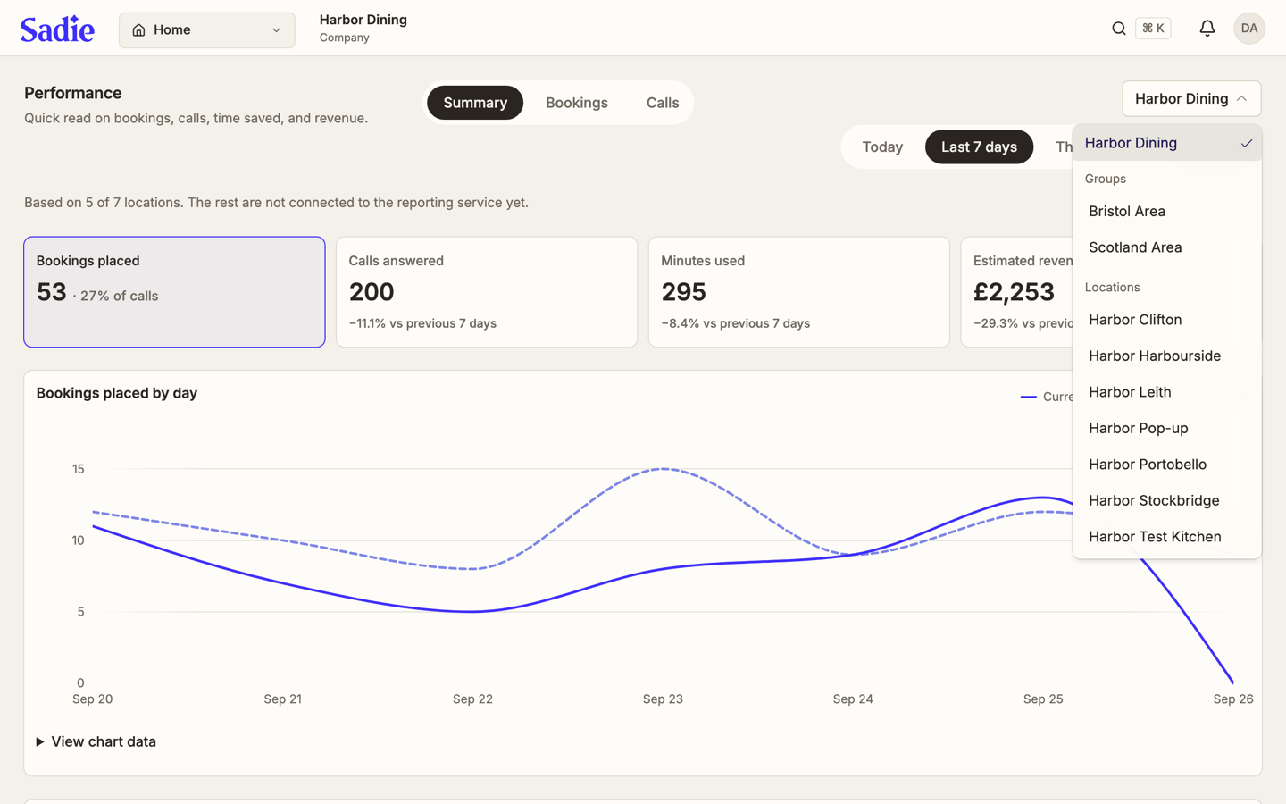
If you have access to one location only, there is nothing to choose and the button does not appear.
Pick a view
Three tabs sit next to Performance: Summary, Bookings, and Calls. Each shows its own set of tiles and its own chart underneath.
Pick a period
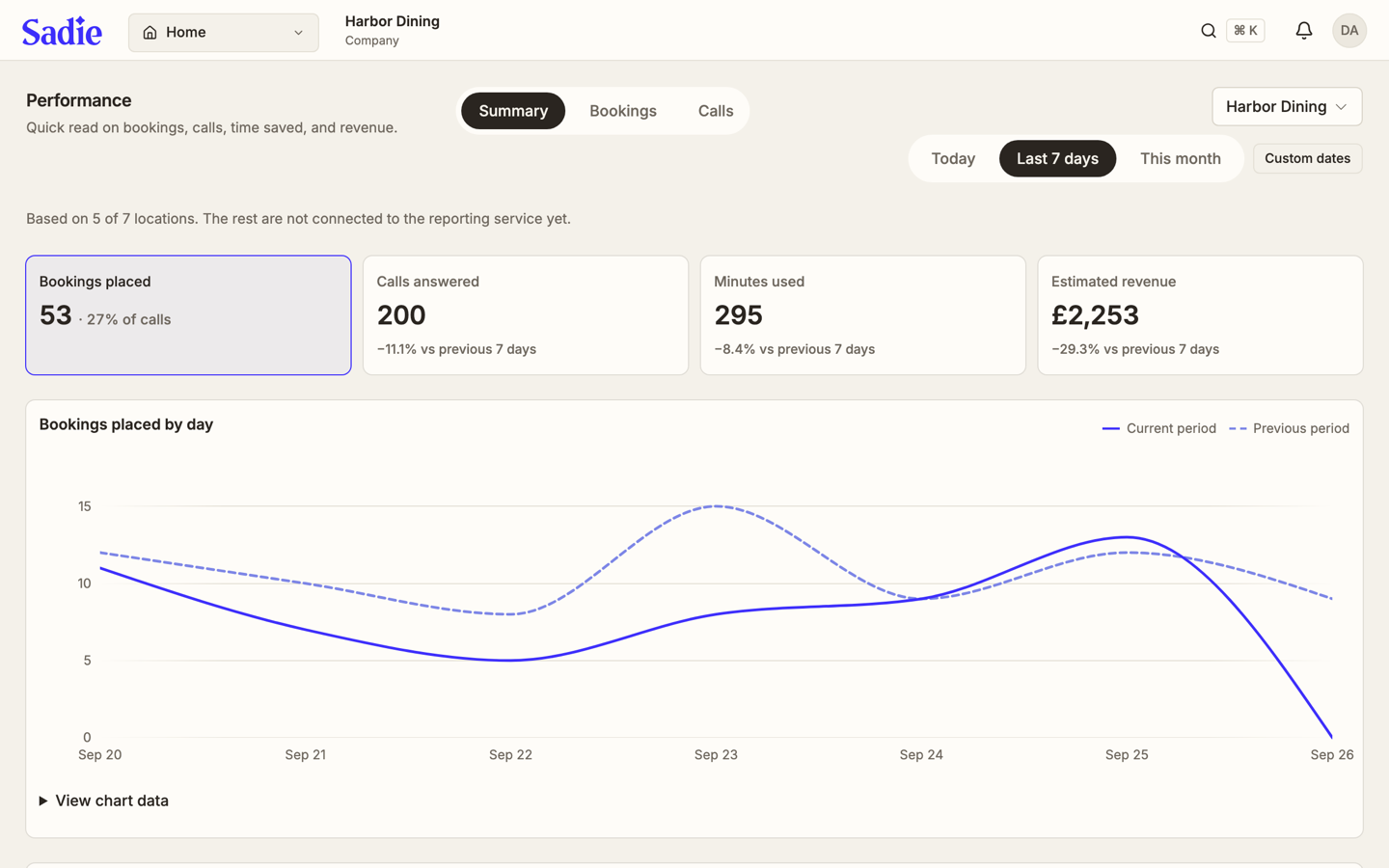
After the company button, choose Today, Last 7 days, or This month, or click Custom dates to set your own range. The tiles, the chart, and the comparison table below all update to that period.
Read a stat tile
Each tile shows a number for the period and a percentage against the period before it, for example -11.1% vs previous 7 days. Click a tile to highlight it; the chart below switches to that tile's number.
On a single location's board, click the Bookings placed tile to open the list of that period's booking calls instead.
Read the chart
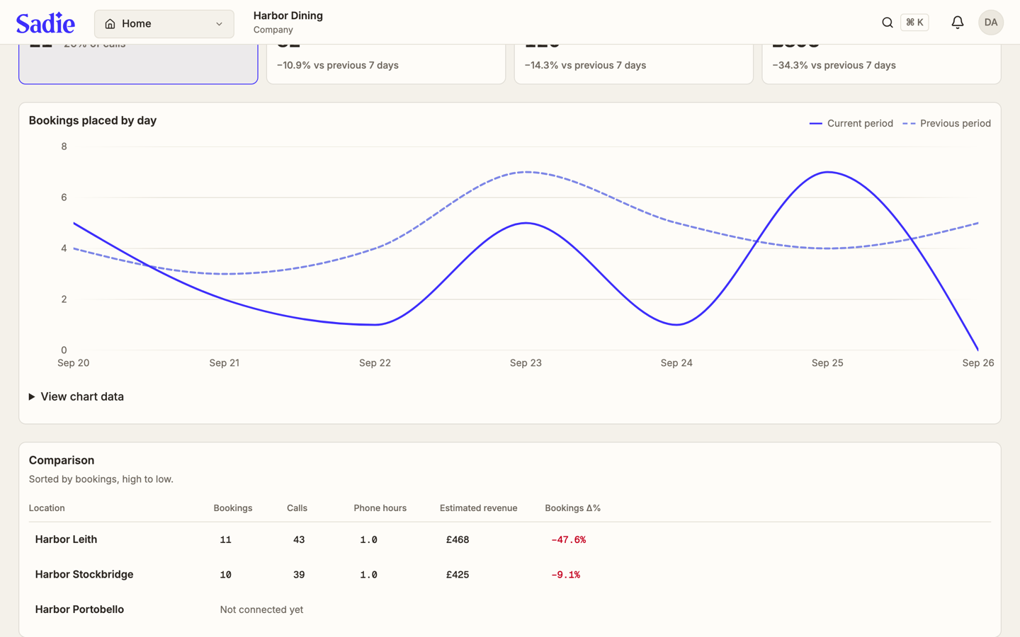
The chart plots the selected tile by day. The solid line is the current period; the dashed line is the period before it, for the same number of days. Click View chart data to open the same numbers as a table, useful if you want the exact values rather than the shape of the line.
Compare groups and locations
Below the chart, Comparison lists the parts of what you chose, sorted by bookings from high to low:
- For your company, it lists each group, plus any location that is not in a group. A group shows how many locations it holds under its name.
- For a group, it lists that group's locations.
- For one location, it lists that location next to the other locations in its group, with your pick highlighted.
The first column says which kind of row you are reading: Group, Location, or Group or location. A location that is not connected to reporting yet shows Not connected yet instead of numbers.
Where you are, and what Home shows
The name at the top of the page, next to the menu, says where you stand in the company. A company admin sees the company's name. A group manager sees the company and their group, for example Harbor Dining · Scotland Area. That name does not change when you pick something else on Home; the button in front of the dates shows what the numbers cover.
Picking a location on Home does not change the location you work on in Settings or the Inbox. Switch that one from the menu next to the Sadie name.
Sharing a link
The address in your browser includes what you picked, so a link you send opens the same group or location for the person who receives it. If they do not have access to it, Home says That link isn't available to you. Showing what you can see. and shows their own numbers instead.
What's next
Handle a conversation: Work the Inbox.